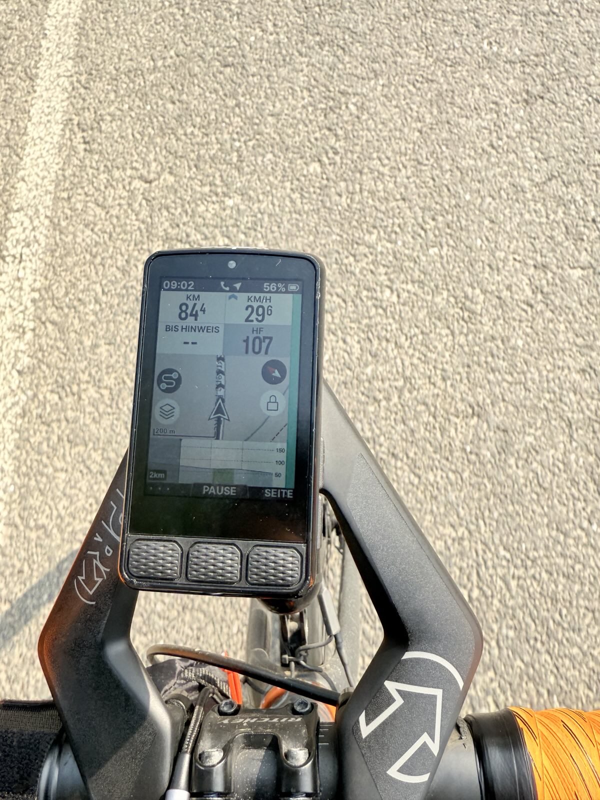
I have already reported that as a bug/feature request but would like to get some support for this here. The issue is that the height indications on the climbing profile are unreadably small. They are even smaller than on the Bolt v2!
The answer from the kind support was, that this is a design decision. But please, have a look and tell me that you can read this:
Even if I squint my eyes and considering my perfect eyesight - this is completely unreadable. And this is bad on longer rides when I cannot see whether there are 50m of climbing approaching or 500m. This has a direct effect on my pacing and nutrition. Please, please @wahoo fix this. And everybody here, please support my request. KTHX!
Here is the Bolt v2 for comparison with its smaller screen and larger font for the height indications.
This is a very fair assessment. The numbers are fine when the R3 is being viewed stationary. While out on a ride, they are very hard, if not impossible to read.
I’m an older rider have cataracts developing, so upgraded from Bolt V2 to Roam 3. There are other issues such as text above buttons, pop up warning ‘Dismiss’, ‘Radar error’ now unreadable on Roam 3. Also, navigation pop up, white text over pale blue with poor contrast.
Wahoo should cinsider poor visual acuity, there are international standards and best practise.
Thank you for addressing this matter: months ago I came to the same conclusion: the fond of the numbers is too small (especially when cycling @xxkm/hr on bumpy roads) if you use a 10 or 12 field Setup or with the 6 field map (which I love). I gave as an example the Garmin 1040 fond type+ setting of the text accompanying the figures; fe. With Garmin you have 10km in the field but when you start riding you only see in that field the 10 which becomes bigger and the km disappears (since YOU know what this 10 means (you have created that specific field)).
I was hoping during the last software update that they would have changed the fond type and make it more readable for cyclists who become already a bit older … but unfortunately they only
Have young people working at wahoo… might need to switch back to Garmin .. that was at least readable during my bumpy rides here in Belgium…
@wahoo you need to consider older/disabled riders with reduced.visual acuity. There are standards for design of visual display screens accounting for Disability Discrimination. Undertake evaluation tests with disabled users for constructive feedback and engage with a Human Factors specialist.
If they want to keep the units, then having / allowing the units to be on the side of the field would seem a reasonable idea.
Far too many interface designs seem to ignore aspect ratio for my liking, not noticing much improvement these days either (Microsoft even removed the ability to have the Taskbar on the sides)
You actually mean SRAM, so good luck with that. (Stares at Powertap C1 power meter where they decided to discard all stock of spare battery covers and gaskets instead of selling them)
A bit off-topic, but just today Favero provided a firmware update for the Assioma Pro power meter pedals bringing the battery from 60h to 160h runtime. Just so.
The same problem happens with the scale of the map on the bottom left corner, it is impossible to read while riding. I bought the Roam 3 coming from a Bolt 2 for the bigger screen but I still have difficulty reading some of the data…
At least, the scale could be made bigger for 3 seconds or so while zooming in or out in the map, then it could go back to being tiny, or even easier, just make the font larger!