Hi.
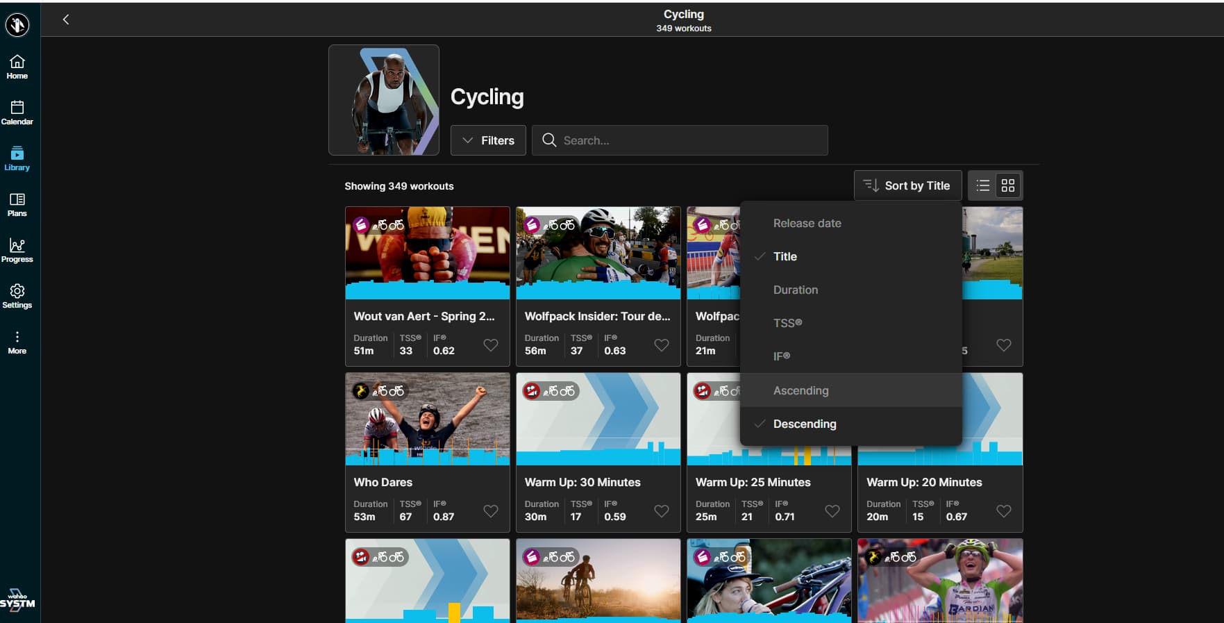
I see that the default list sorting has been changed to “Sort by release date”?
Is it possible to change this back somehow?
I don’t remember when Lower back recovery 1 was released. But I know it starts with L.
I can find them faster by scrolling on the Title sorted list, than searching for it.
I don’t see any user setting where it can be changed to another default. Or is it somewhere I don’t see?
Def should remember the last chosen sort selection but…
I can kinda see why they have release date as the default as it highlights and brings to people’s attention new content they may not be aware of (and which the minions are proud of) . What I don’t see is what the release dates actually are. Is this available somewhere?
I don’t mind that sorting is by release date however does not sort correctly in “Week With” videos as the UCI are not together and only one of them is in first group despite UCI series being the newest addition. The rest are grouped with Neil Henderson.
Also videos in a group should be in order. For “Week With” should have introduction first and then in correct sequence as intended for the week. Currently all mixed up.
I know I can change it, but it doesn’t keep the change. I could almost accept it as the default if it was the actual release date. But it’s not. It seems like it’s kind of a “newest” sort but minor modifications or repairs to older vids seems to make them newer than they are.
Still fine! I haven’t logged off and gone back in but I have gone into all the other pages and gone back to calendar and the drop down options are still there?? both in the “web” app and the “workout app”
For me, go into Library, Cycling, filter by Title and Ascending, workout list changes as desired, go to Calendar tab, return to Library tab, back into Cycling, and default is back to Sort by Release Date rather than keeping the persistence of my chosen filter option no less than 10 seconds prior.
No need for me to log out etc.
Persistence stays there when staying in Library and going through workouts. Persistence lapses when leaving Library.
Means having to suck it up and use the default or each time entering Library, go through my filter options. PITA!
Annoying indeed.
You can use a Back button to get back to Cycling instead of going through the Library → Cycling. Filter settings are preserved then.
It works in web app, as you can click on browser back button.
It works in Windows app, too, You just need a back button but if you had a keyboard or mouse that allows key assignment then you could assign back functionality to one of the keys and use it in the same way as the back button in web browser.
Not a solution, workaround rather.
I thought it might be ok as a default, but I’ve found it remarkably irritating. That was partly based on user selected options persisting when navigating between sections in the app; as a dev, i’d call the fact it’s not, and the enforced default is… quirky (?), a fairly fundamental UI fail - you just don’t implement interfaces like this unless you want to piss people off.
If the intent was to promote new workouts, videos, and so on (which is a good idea I think) then maybe reworking the individual library category pages might help. Currently i’m seeing, on the phone, over 50% of the page used up before the first workout item, but a large wasted space next to the category picture.
That area could be turned into a scrolling widget with the latest stuff previewed maybe, or split and used to host the filter, search, or other widgets, or whatever
We also don’t need the category title, e.g. “Yoga”, listed twice, that’s just pure wasted space on top- especially as the second title is off screen almost as soon as you scroll.
Love a lot of this app, this change and layout, not so much